


Why Netflix shows you just one thumbnail
Psychology blends with product strategy to keep you hooked

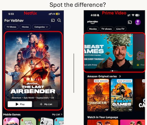
Ever notice how Netflix hits you with just ONE big thumbnail recommendation when you open the app?
It's a bold choice. On the other hand, Prime Video has a carousel of 12 options. Apple TV has 15, Disney+ has 8.
Your first thought might be "Ah, classic Paradox of Choice - fewer options mean less decision fatigue." And you're not wrong. But there's something far more fascinating at play here.
Psychology of rejection
In both cases (single vs multiple options), the experience works equally well if the algorithm successfully predicts your next favorite show. But the emotional journey is significantly different when the recommendations fail. Here's what happens in your brain:
Prime Video: You swipe through a carousel of options. Nothing catches your eye. You keep swiping. Twenty seconds later, you're still swiping. Each rejection requires a tiny bit of mental energy. Each missed recommendation feels like a small failure of the algorithm to understand you. After a minute of this, frustrated and mentally drained, you're likely to switch apps entirely.
Netflix: They show you one big recommendation. One glance tells you "not this." The mental cost of rejection is minimal. More importantly, you still have the energy to either scroll down or use the search button. They've kept you in the game.
It's like the difference between a friend bombarding you with ten restaurant suggestions versus confidently recommending just one place. The single recommendation feels more thoughtful, and rejecting it feels less overwhelming.
Know thy user
This isn't just about UX. It reveals deep insights about each platform's DNA.
Amazon built its empire on endless choice—it's literally why people go to Amazon.com. Prime Video serves a lot of these same users (remember, it comes bundled with Prime). Their users probably have the same “browse everything” mindset.
Netflix, however, built its brand on something entirely different: "We know what you'll love." From its early DVD-by-mail days to its current streaming dominance, Netflix has positioned itself as your personal entertainment curator. And their users expect world-class recommendations.
Fun fact: Netflix ran an annual competition from 2006 - 2009, called the Netflix Prize. It had a prize money of $1 million for anyone who could beat Netflix’s own prediction algorithm by 10%. That's how serious they are about getting that ONE choice right for their users.
A Tale of Two Metrics
It’s fair to expect that both Netflix and Prime Video experimented with single vs. multiple thumbnails. But most likely, they had different North Star metrics.
Prime Video appears to optimize for thumbnail CTR (Click-Through Rate). More options in the carousel mean a higher chance of someone clicking at least one of the thumbnails.
Netflix likely optimizes for total watch time per session. They're willing to accept a lower initial CTR if it means users who do engage watch for longer periods. Why? Because they've preserved the user's mental energy for meaningful content discovery.
Closing thoughts
This is a great example of how different North Star metrics can lead to radically different user experiences. Prime Video and Netflix aren't just making random UI choices – they're building experiences that align with their core business strategies and user preferences.
It’s the classic product tradeoff: Optimizing for immediate engagement vs. long-term retention.
The best product decisions might feel incorrect at first glance. But when you dig deeper into user psychology and align them with business goals, they reveal themselves to be surprisingly sophisticated.


